
Side Labels - EnlightenMint Tea
Description
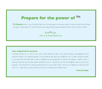
For this project the goal was to create two labels
for a line of beverages. I choose to design tea labels. After doing
research
into
competitors
and demographics of tea drinkers I set out
to create labels that would stand out from the crowd, while at the
same time giving the feeling of tea packaging. The names of the tea
denote the feeling that the tea may give you combined with the flavor
of the
tea. The colors evoke the kind of tea.
The packaging the labels were intended for was a brown cardboard box
that
would hold
individual one serving tea packages.
Date
April 2004
Client(s)
Typography III
Art Director
Timothy O’Keeffe
Typefaces
Gill Sans