
Part I - Following Type Rules
Description
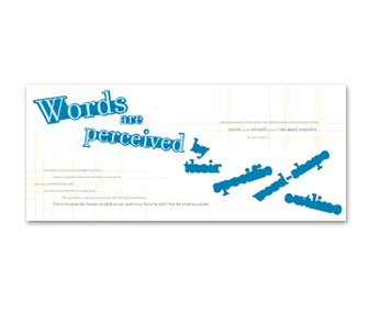
The goal of this typography exercise was to research type rules and illustrate
how to follow and how to break these rules through the design of two
different posters.
The first rule was, "Words are perceived by their specific word-shape outline," from an article entitled "Legibility" by Rolf F. Rehe in a book entitled Graphic Design and Reading edited by Gunner Swanson.
The second rule was, "According to Cambridge University it doesnt matter in what order the letters of a word are, the only important thing is that the first and last letter of the word are in the right place. The rest can be a total mess and you can still read it without a problem. This is because the human mind does not read every letter by itself, but the word as a whole," was from Cambridge Universitys website.
The third rule was, "The neurological structure of the human visual system benefits from serifs in the preservation of the main features of the letters."
Date
February 8, 2004
Course
Typography III
Instructor
Timothy OKeeffe
Dimensions
Following Type Rules: 14" x 16"
Opposing Type Rules: 5" x 15"
Typefaces
Following Type Rule: Filosofia
Breaking Type Rule: Anglo-Saxon, Atman, Renaissance, Beachhouse, Bighouse, Broadband, Clover, Desdesmona, Engravers, Dollhouse, DomCasual, ER9, Exocet, Filosofia, FlemishScript, Gangly, House-A-Rama-Strike, Italia, JFWildWood, Kaiser, LucidaBlackletter, LucindaBright, LucidaSans, Civet, RubinoSansICG, SignPainter-HouseBrush, SignatureFont, Snap, Swing, Variex, Wendy and Universe.