
Design
Exercises
|
Page 1/2
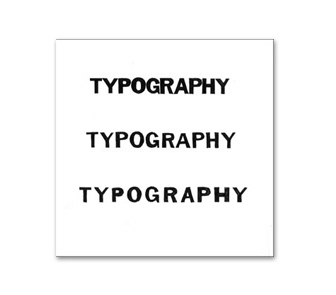
Letterspacing Exercise
Part I - Franklin Gothic Roman
Part I - Franklin Gothic Roman
Description
For this typography exercise I explored letter spacing in a hands-on way by hand-tracing the letterforms that make up the word typography in two different typefaces: Franklin Gothic Roman and Bembo Regular at 54 points in all caps and placing them how I thought they should be spaced to look tightly, normally and loosely spaced.
Date
October 21, 2002
Course
Typography I
Instructor
Timothy O’Keeffe
Dimensions
48p x 48p
Typefaces
Franklin Gothic Roman and Bembo Regular
Materials
Black Gouache, Various Ink Pens, Rapidograph Pen, Drafting Pencil, Eraser,
Illustration Board, Triangle, Ruler, Compass, T-Square, Watercolor
Brush, White Out and Exacto Knife.